
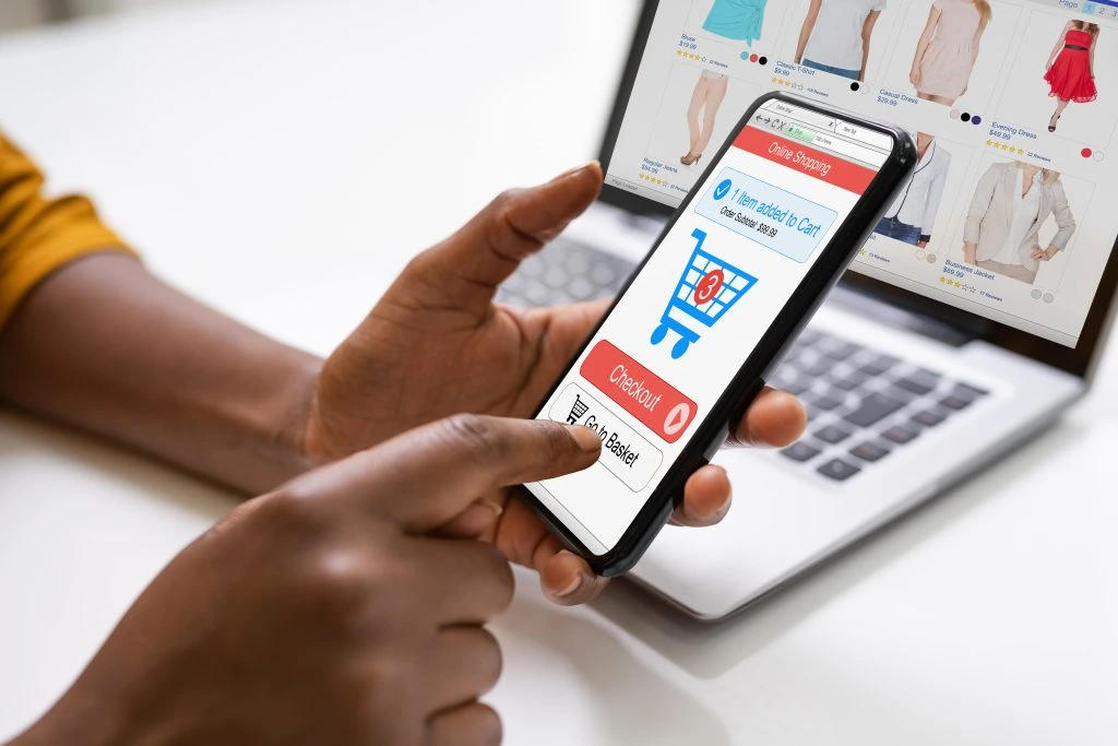
It is no longer an option: A DTC brand must optimise its ecommerce site for mobile. And the numbers bear this out. Nearly 180 million Americans shopped during the 2021 holiday period from Thanksgiving Day through Cyber Monday, according to the National Retail Federation. Although brick-and-mortar foot traffic bounced back, digital shopping was hot once again. Online sales across November and December rose 5% globally to $1.14 trillion and 9% in the U.S. to $257 billion.
American consumers spent $5.1 billion online on Thanksgiving Day, the same as in 2020. Black Friday alone saw 88 million buyers rack up $8.9 billion in online sales. 43% of those sales came from mobile devices, up from the 36% of mobile purchases in 2020.
While mobile purchasing grew, it seems consumers still prefer to buy on desktop rather than on mobile. Consumers might like to browse on their smartphones, but they’ll opt for desktop when it’s time to click “Buy.” It seems brands still need to meet several conditions before convincing consumers to make purchases of their handheld devices.
Here are a few ways ecommerce brands can ensure that their online store is optimised to capture mobile sales.
Go Native
Today, it is not enough for brands to have a “responsive” version of their desktop website. To be truly “mobile first,” brands need to create a browsing and buying experience that is natively built for smartphone users. This includes capturing unique smartphone capabilities such as swiping and geo-targeting.
Most designers start by building an online store for the desktop and then translate that experience for the smaller screen. This usually results in compromises in how products are displayed, discovered and purchased. It also means the “mobile site” is not designed around the mindset of the highly impatient mobile user.
For example, correctly engineered payment and customer data (name, address and phone number) can be enabled with a single smartphone tap. But desktop-turned-mobile sites can rarely achieve this level of ease.
Support Both Browsing and Buying
Smartphone users usually arrive at an ecommerce site with one of two goals in mind. They are either browsing or looking for something in particular, perhaps an item they saw in a physical store. A mobile site should fully support both activities within the same environment, which can be a challenge to pull off.
For consumers looking to browse, a site should have images of products that look good on a mobile screen. Product pages should display only the most essential information, with more detailed descriptions a tap away. Swiping or tapping through the different categories of products should be super easy to do.
Users eager to find a particular product should not have to search for the search box. The search box should be highly visible and accessible at all times. Ideally, the site should enable predictive search results and “smart search.” The latter automatically fills the screen with the search box to make typing and viewing easier. Visitors should also be able to use search filters to drill down to the specific product they have in mind.
Nail the Mobile Navigation
As the above illustrates, the ease by which users navigate through a mobile site makes a big difference in conversion rates. At the same time, navigation links need to be highly efficient within the space-restricted mobile environment.
The most important links will go into the header navigation bar. Today’s trend is to use a “hamburger menu” to collapse subpages into an icon that looks like three short vertical bars. These sub-pages can consist of product category links, settings, store locator or contact info. A hamburger menu will give a mobile site more room to display essential links in the header. These links typically include the search bar, the shopping cart and a logo that doubles as a homepage link.
But the hamburger menu can also lead to “menu stuffing,” or putting too many unnecessary links in the menu bar. While it may be confusing to many consumers, menu stuffing and the hamburger menu can be avoided altogether. A sticky bar that’s visible at all times can be used instead, as Glossier has done with its mobile navigation. Since only so many links can fit in the navigation bar, product offerings should be organised in a minimal but logical manner.
Many mobile sites also use icons rather than text to conserve space. In these cases, icons need to be instantly recognisable so users know exactly what they are clicking on.
Make It Lightning Fast
According to Google’s research, the average mobile landing page takes 22 seconds to load. Yet, the majority of users will leave a mobile page if loading takes longer than 3 seconds. That discrepancy does not bode well for sales if an ecommerce site is slow to load.
We have written before about how slow site performance can hurt ecommerce businesses. Site speed is even more crucial on mobile, as smartphone users have even less patience than desktop users. As such, mobile site performance should be at the top of an ecommerce business’ priorities.
Enable Simple Checkout
Speaking of speed, the checkout experience of an ecommerce store should be as fast and seamless as possible. According to a Harris Poll, two-thirds of shoppers abandon online purchases on mobile devices due to poor checkout experiences. Ecommerce brands need to remove as much friction as possible to decrease cart abandonment rates and increase conversions.
Here are some ways to do this:
- Offer multiple third-party payment options such as Apple Pay, Google Pay, Amazon Pay, etc.
- Enable guest checkout
- Keep mandatory fields to an absolute minimum
- Stack fields in vertical rows and keep to one field per row
- Break up the checkout process into multiple pages
- Use a progress bar to keep users engaged
- Keep to one prominent call-to-action button per page
- Offer the option to “click-to-call” a customer service line so users can complete purchases with a live human instead
- Enable auto-detect and auto-fill on forms (supported by Safari and Chrome)
- Trigger numeric keyboard for credit card and phone number entries
- Enable address finders so home and shipping addresses can be autofilled
Address Security Concerns
Security worries can be a big barrier for many mobile ecommerce customers. Nearly half of consumers believe that mobile devices are less safe than PCs and laptops in protecting their personal data.
Overcoming these concerns will lead to higher conversion rates. At a minimum, an online store should have an SSL security certificate. SSL creates an encrypted link so sensitive information (credit card and Social Security numbers, login credentials) can be transmitted securely.
Make Sure the SSL Padlock Icon Is Prominently Displayed
Better yet, SSL certificates can be combined with an Extended Validation Certificate (EV). An EV is a higher level of certification that allows brands to display a green address bar. Many consumers feel more comfortable giving their information to sites with these green bars.
U.S. conversion rates on desktop ecommerce sites are three times as high as those on smartphone-specific sites. The best practices mentioned here will go a long way toward encouraging customers to click “Buy” while on their mobile devices.
Launching and optimising an ecommerce channel is complex and resource-intensive. DTC and cross-border solutions from ESW let you expand into new markets quickly by taking on some or all of your ecommerce operations. From webstore development to localised payments and logistics, let the experts at ESW help you deliver world-class experiences that drive global revenue.


