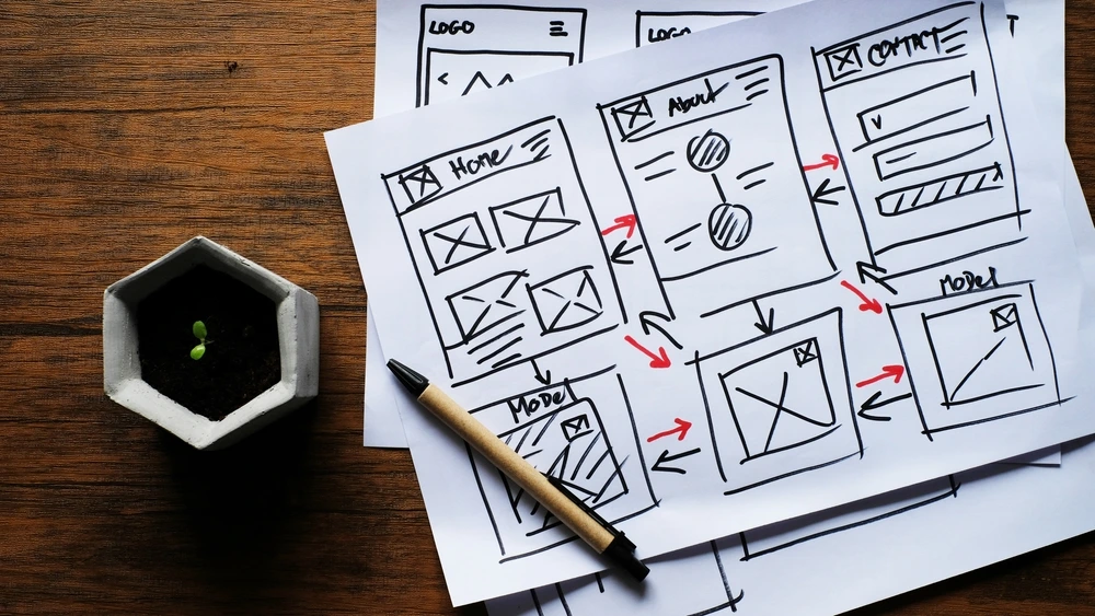
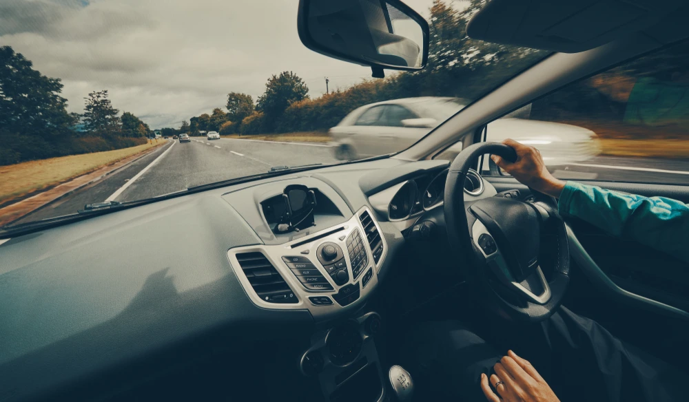
User experience friction can be compared to driving. Imagine driving down the motorway and encountering speed bumps, roadblocks or traffic stops every half mile or so. Besides being annoying, these barriers can seriously impede progress and keep a driver from getting quickly from point A to B. They may even force a traveler to give up and turn around.
But sometimes, having to slow down means having the opportunity to notice new scenery. Having to take a different route lets the driver discover a new – and potentially better – path.
Like in driving, online shoppers can expect to encounter roadblocks on the shopping journey. And much like a driver frustrated by roadblocks, too much website friction can cause shoppers to give up altogether. In fact, user experience friction is a major cause of cart abandonment and can be devastating to customer retention and brand loyalty. But user experience friction, if leveraged correctly, lets merchants better personalise the shopping journey and build trust.
What Is User Experience Friction?
User experience (UX) friction is any disruption in the customer journey that distracts from completing a purchase. Friction is annoying because it causes users to jump through too many hoops by adding unnecessary or disruptive steps. Ever had to sit and wait for a website to load or fill out forms before making a purchase? If so (and who has not?), that is friction. Other causes of website UX friction include:
- A complicated checkout process
- Poor or unintuitive website design
- Asking customers to create an account before making a purchase
- Popups that take up most of the viewing area
- Broken links or bugs on a website or app
- A clunky mobile experience
- Unclear or confusing content
The Negative Impacts of User Friction
Whatever the cause, cart abandonment caused by friction can seriously impact a brand’s conversion rates and revenue. According to 2022 statistics, user friction causes approximately 71% of online shoppers to abandon a cart before purchasing. Ecommerce brands lose USD $18 billion in sales each year to cart abandonment. Not only that but:
- 55% of shoppers abandon carts due to unexpected fees, including shipping costs
- 21% leave a site due to complicated or lengthy checkout experiences
- 17% cite lack of trust as a cause for abandonment, fearing credit card theft or other security concerns
These facts and figures point to one obvious conclusion: ecommerce brands need to eliminate as many sources of user friction as possible.
The Importance of User Experience (UX) in Ecommerce
Ecommerce is not just about selling products. It is also about building trusting relationships by giving customers consistently pleasurable and rewarding experiences. The goal is to make visitors feel comfortable shopping and to earn their trust by creating an emotional connection.
As the term suggests, UX is an experience, so it needs to encompass every part of how users interact with a website. UX gives meaning and value to the interaction between the user and brand at every stage of the customer journey.
Customers want a clear shopping path so they can easily find what they need, buy it and move on. The last thing they want is unnecessary or needless roadblocks that impede their progress and cause frustration or anger. Creating memorable experiences will keep customers coming back for more. Ultimately, enjoyable UX can dramatically boost conversion rates, increase customer satisfaction, promote brand recognition and drive website traffic.
Five Ways to Reduce Website Friction

An unfortunate truism in ecommerce is that friction is inevitable and impossible to eliminate completely. Fortunately, there are practical steps brands can take to minimise friction and mitigate its negative effects. Here are just a few:
Reduce Click and Steps
Ecommerce brands need to minimise the number of steps and clicks it takes to complete a transaction. The more steps it takes to purchase, the more likely a customer will get frustrated and bail out. Brands can increase conversion rates and customer satisfaction by using thoughtful design to speed the customer along the buying journey. The less starts and stops, the better.
Optimise the Website Design
A key step to reducing website friction is to improve the design. An optimised website should facilitate customer movements from one step to the next and make purchasing as simple as possible. It should also load quickly and be responsive on all devices. Other website optimization tricks include:
- Clear and concise content and product descriptions
- A clean look with lots of white space
- Intuitive and user-friendly navigation
- Easy to find search bars, CTAs and buttons
- Simple, one-click checkout
- Easily visible Contact Us and FAQ pages
Increase Website Speed
47% of consumers expect a web page to load in two seconds or less. 40% of people abandon a website that takes more than three seconds to load. Improving site speed can go a long way in removing friction from the digital shopping experience. High-resolution graphics and images are the biggest culprits here. Simply reducing the size of graphics can dramatically improve site speed.
Offer Multiple Payment Options
By offering flexible payment options, customers can use their preferred payment method. Giving customers multiple choices makes them feel comfortable and raises the likelihood they will make a purchase. Offering alternative payment gateways like BNPL can encourage customers to make buying decisions and reduce cart abandonment.
Do Not Ask for Unnecessary Customer Information
Asking for customer information at checkout is essential for personalization, but it also increases friction. “Less is more” should be the mantra when it comes to collecting personal information. Brands should collect only essential information, such as name, email, shipping address, and payment details. Just asking for what is needed eliminates extra steps and needless questions that can confuse and annoy customers.
What Is Positive Friction (and Why Is It a Good Thing)?
Up to this point, we have examined why ecommerce brands need to eliminate as many sources of UX friction as possible. It may seem counterintuitive to suggest that some website friction may actually improve the user experience. To refer back to the traveling analogy, there just might be some value in keeping a few bumps in the road.
That is the concept behind positive friction, which sets up additional but beneficial hoops so customers can consider their actions before purchasing. The primary goal of positive friction is to keep customers from making mistakes they might regret later.
Being able to reflect on a purchase is vital in the customer journey. A reported 54% of consumers want time to reflect on big purchases, and 34% want to ensure they have bought the item suited to their needs. Since 88% of Americans buy things impulsively online, getting them to think before buying might be a good thing.
Improved Security and Personalisation
Positive conflict also safeguards online brands and their customers against fraud, which saves time, money and brand reputation. Even simple actions like adding multi-factor authentication can boost security by protecting against fraud.
Examples of positive security-related friction include:
- Confirming or validating important actions
- Enhanced security steps like two-factor authentication
- Asking for cardholder CVV (Card Verification Value) at checkout
- Requiring a unique password for each online account
- Asking customers to verify an order before checkout
Improved personalization is another benefit of positive friction. Studies show that 57% of consumers are willing to stop and provide personal information in exchange for exclusive deals and offers. This information can help brands build the types of enhanced personalised experiences that meet or exceed customer expectations.
For example, marketplace sites that sell across verticals and sectors – automotive accessories, vintage handbags, textbooks, etc. – offer new site visitors the opportunity to complete a form or fields in a popup regarding the visitor’s interests. By inserting small, positive friction, the visitor experiences a tailored browsing experience.
Brand sites can also leverage positive friction by asking visitors to complete a style quiz in order to deliver personalised search results. Additionally, brands can send SMS notifications when a customer’s favourited item is on sale or an out-of-stock item becomes available.
Get the Balance Right
Brands need to get positive friction right. Otherwise, it is just friction by another name. Brands that can maximise positive friction can build loyalty and improve conversion rates and customer retention. Striking a perfect balance between positive and negative friction is not easy, but the rewards make the effort well worth it.
If your business is ready to personalise the customer experience and optimise for cross-border expansion, let ESW be your partner for success. From cart and checkout solutions to design-build-run options, global expansion has never been easier. Contact us today.


