When expanding DTC ecommerce channels globally, brands rightly focus on getting websites launched and accelerating speed-to-market. From engaging vendors, to building and deploying ecommerce sites, to partnering with localised checkout solutions and logistics firms, brands focus on starting strong.
And brands should. Launching quickly with the right partners accelerates the ultimate goal of market expansion: revenue. But global DTC ecommerce is not a set-it-and-forget-it endeavour. For sustained success, brands need a collaborative team of multi-disciplinary experts whose common goal is to drive long-term revenue and customer loyalty.
Brands that enlist merchants of record, like ESW, may already have access to a team of researchers, analysts, designers and developers who all have a vested interest in brand success and ongoing revenue growth.
UX design is a key discipline that brands need to achieve growth. The design of a DTC ecommerce website is essential to achieving a higher conversion rate. Shoppers leave sites and brands lose sales when there are site elements that annoy or distract visitors. But with proper evaluation and design, brands can capture the data they need without increasing customer friction.
Read more below for a case study in UX design that illustrates the power of partnership and robust processes focused on achieving brand goals.
Introduction
The design research team at ESW were tasked by a global clothing brand to redesign its newsletter modal (a pop-out element that displays on top of other content on the page) on international sites in order to increase user signups. The client wanted to ramp up the number of times the modal would display to the user – a dark pattern that could cause more harm than good for users. Dark patterns are design elements that deliberately mislead or deceive website visitors into making unintended choices. These tactics can damage the brand’s reputation.
First, research was done on the best practices for website modals. This was followed by competitor analysis on ecommerce sites that went with a modal approach to target users and encourage them to subscribe to the brand’s newsletter. Finally, a user test was conducted with users from two countries in the target market to better understand their views on modals.


Research Findings
A pop-up newsletter modal is a popular method for ecommerce websites. Research has shown that modals may seem intrusive, especially if misused, but research also shows that they improve conversion. They work by offering something of value (like a discount) and utilising specific triggers (like a user’s exit intent) to display a pop-up experience that is not annoying and generates leads.
Timing is another crucial factor to consider before displaying a pop-up. There is nothing more frustrating than landing on a website for the first time and being immediately met by an opt-in email pop-up. Users have yet to engage with the website. Why would they be willing to give up their email addresses? A better approach is to be patient and wait for the right time to display it. One study found that waiting to display a pop-up until a visitor had viewed two pages produced more than double the conversion rate compared to the first landing page.

User Testing
The design team created a user test to better understand how users would respond to a newsletter pop-up on the clothing brand site. We tested 32 users from panels in the brand’s target markets. 53% said they would occasionally sign up for newsletters on ecommerce websites, compared to 38% that would never. The user’s most significant motivation for signing up for a newsletter was a discount (63%), while not far behind were exclusive deals (47%). Very few users signed up for newsletters based on exciting content (28%) and the discovery of new products (22%). 94% of users were more likely to sign up for a newsletter if a discount was included.
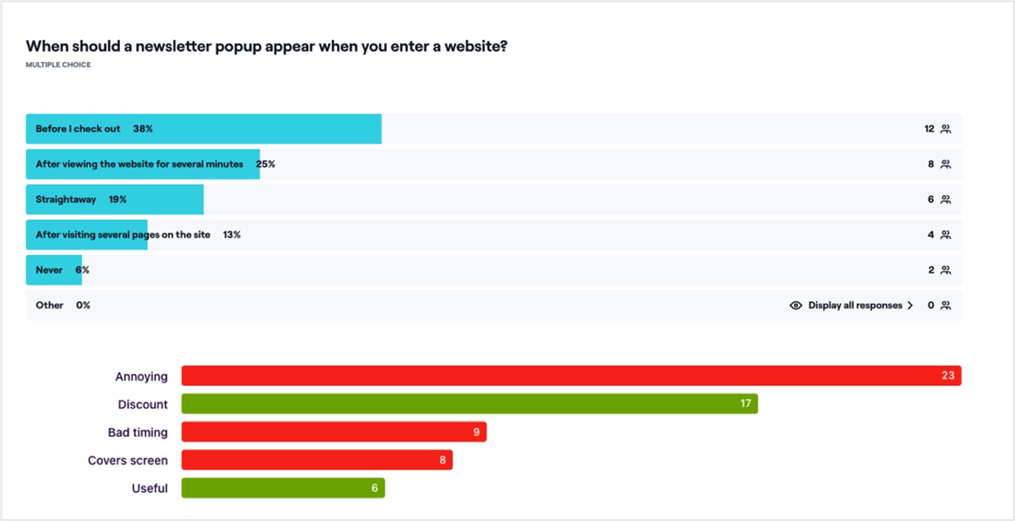
We asked users when a newsletter pop-up should appear on a website. The highest response was before the checkout (38%). Users agreed that this is the place to sign up because they are about to make a purchase and want to receive a discount before purchasing. Many users agreed that newsletter pop-ups can be annoying, but with a deal included, they can be beneficial.
Data-driven design
Based on our research, the newly redesigned newsletter modal will be displayed to the user on their first visit after at least 15 seconds. From Google Analytics, we know that the average time a user spends on a page is 37 seconds. If the user closes the modal, they will receive another pop-up on the shopping bag. However, it will not be a modal that will appear. From analysing competitors, we noticed that toast notifications (non-modal, hidden elements to display a short message) at the bottom or top of the page are becoming more common on sites. This technique is less intrusive to the user and does not disrupt their flow, especially on the shopping bag. The notification will display “Get 10% off”. It will show after several seconds, catching the user’s eye but not obstructing their view.

Next Steps
It is vital that we track and understand the impact the redesign is having on customers. The current opt-in rate for new users range from between 1.1-1.5% in the countries tested. Our brand partner is aiming to get close to 3%. Trackers have been set up on the new modal and toast notification to track the impact between the old and new designs.
Re-design Results to Date
Since its implementation three months ago, we have grown the opt in rate from an average of 0.7% to 1.5%. That’s over a 100% increase. Some weeks saw sign-up rates as high as 2.8%.
The Takeaway
To achieve the brand’s goal of increasing newsletter signups, the UX team performed extensive research and testing to arrive at a new design and will continue to test and learn in order to achieve the client’s goal.
Brands with DTC ecommerce channels cannot underestimate the power and value of having the right team. Partners who share the brand’s goals and are invested in long-term success can better optimise the shopper experience and more quickly increase revenue and loyalty.
If your brand is ready to achieve both speed-to-market and sustained global success, turn to ESW. We help the world’s best-loved brands launch a global ecommerce presence and develop strategies to long-term growth. Contact us today.


